
team rubicon
Los Angeles, CA
User Experience & User Interface Design
Team Rubicon’s mission is to provide disaster relief to those affected by natural disasters, be they domestic or international, by pairing the skills and experiences of military veterans with first responders, medical professionals, and technology solutions. I have worked with Team Rubicon on an ongoing basis as their User Experience and User Interface Designer on both their marketing website redesign and internal Volunteer Management System redesign.
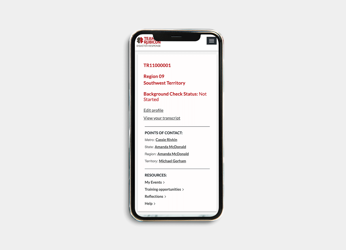
Volunteer Management System
Problem
As an organization with a growing membership base, Team Rubicon did not have the proper systems in place to mobilize and train new members. Because the system was manual, valuable staff hours were allocated to these tasks while volunteers frustration levels rose.
Solution
Create a portal that is used for volunteers to maintain their profiles and qualifications, access training opportunities and social events within their region, and apply for deployment on current and upcoming operations.
INTERVIEW KEY FINDINGS
Unclear Form Errors
When filling out the deployment application, users are met with error messages that do not describe a clear path forward to reconciling the field error.
Left In Limbo
After a user submits all information required on the operation deployment application form, they do not receive any form of confirmation and/or status of application.
Operation Details
Once approved for an operation, the user must look for deployment details in multiple locations which also include various types of communications.


PERSONA
James Lee
Male, 35 years old, Married
Frustrations
James wants to go on more deployments with Team Rubicon but finds he is often stood down from deployments with little explanation. Too many hard stops in application process. Has difficulty connecting directly with TR staff through email or phone to discuss rejections.
Goals
Remedy any issues that are causing him to be stood down on deployments so that he can be more involved in the organization.
user flow

User Testing Key Findings
Progressive disclosure for the application process created a lower level of stress on user.
Users highly valued the wealth of information on the deployment page. Suggested even more content live here.
Steeper learning curve for selecting availability on calendar than expected.

Hi-Fidelity screens


Next Steps
Create additional ways for volunteer engagement through the portal post deployment.
Explore possible communication functionality between volunteers pre-deployment through portal.
